Petersburg tennis academy
Petersburg tennis academy
BRAND IDENTITY / WEB DESIGN / SQUARESPACE E-COMMERCE
Project Overview: Petersburg Tennis Academy Website Design & E-commerce Integration
The primary goal of this project was to design and develop a visually appealing and user-friendly website for a tennis academy, complete with e-commerce functionality. This feature empowers clients to seamlessly purchase classes online, streamlining the booking process and enhancing customer satisfaction.
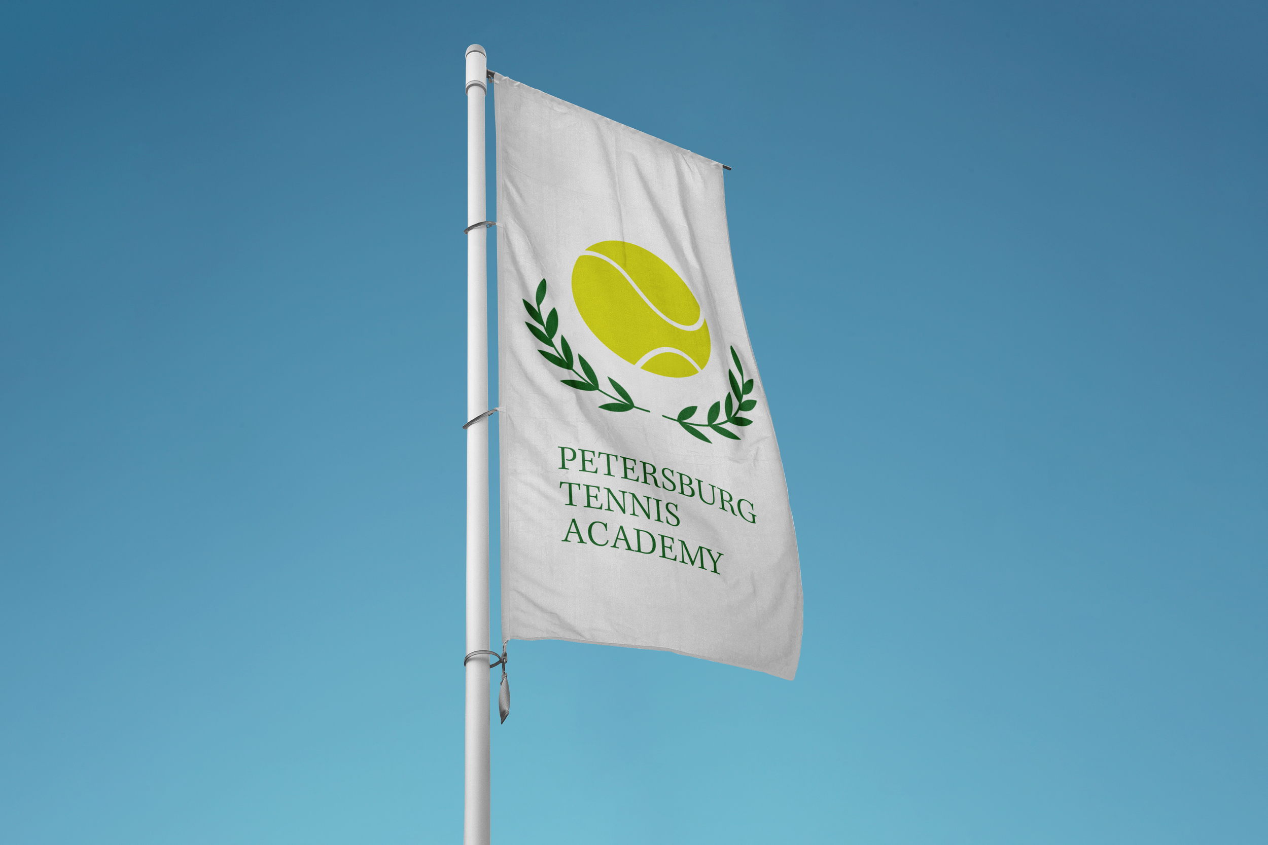
Alongside the website development, we crafted comprehensive branding guidelines to ensure the tennis academy's new business identity remains consistent and strong across all platforms. By incorporating targeted keywords and engaging language, our team successfully created a striking online presence that effectively showcases the academy's offerings and attracts potential clients.
Timeline
4 weeks with regular check-ins and feedback sessions to ensure the design is meeting the client's expectations.
design process
_______________
01/ WEB DIRECTION
The initial phase involves establishing a cohesive visual direction for both the brand and its website. To achieve this, we gather vital information from the client through questionnaires and conduct thorough industry research to identify market niches, customer personas, and brand messaging.
This process allows us to create web direction materials that serve as a guide for crafting essential branding elements, such as logo sets, color palettes, and typography.
____________
02/ DESIGNING WIREFRAMES
Upon approval of the branding guidelines, we focus on designing website wireframes. This includes creating a sitemap, determining an effective and intuitive user flow, and developing prototypes of crucial pages using Figma.
Once the wireframes receive the client's approval, we start constructing the actual website on Squarespace.
________
03/ SQUARESPACE CUSTOMIZATION
During this stage, we build all the pages, set up the e-commerce profile, domain name, and other essential components. The client is provided with three rounds of revisions to ensure their satisfaction.
The website is then successfully launched within the agreed-upon timeline, creating a stunning online presence that effectively showcases the brand and its offerings.
STYLE GUIDE
Armed with the client's vision for their brand, we centered our approach on the concepts of accessibility and professional excellence. To achieve this, we opted for a neutral color palette complemented by two accent colors, which, when combined with an elegant yet approachable typography set, effectively conveyed the brand's identity. The resulting style guide strikes a harmonious balance between sophistication and accessibility, ensuring the brand resonates with a wide range of audiences while maintaining a high level of professionalism.